Finixy Landing Page Gets a Complete Visual Revamp
A cleaner, more visual experience that finally shows what Finixy can actually do
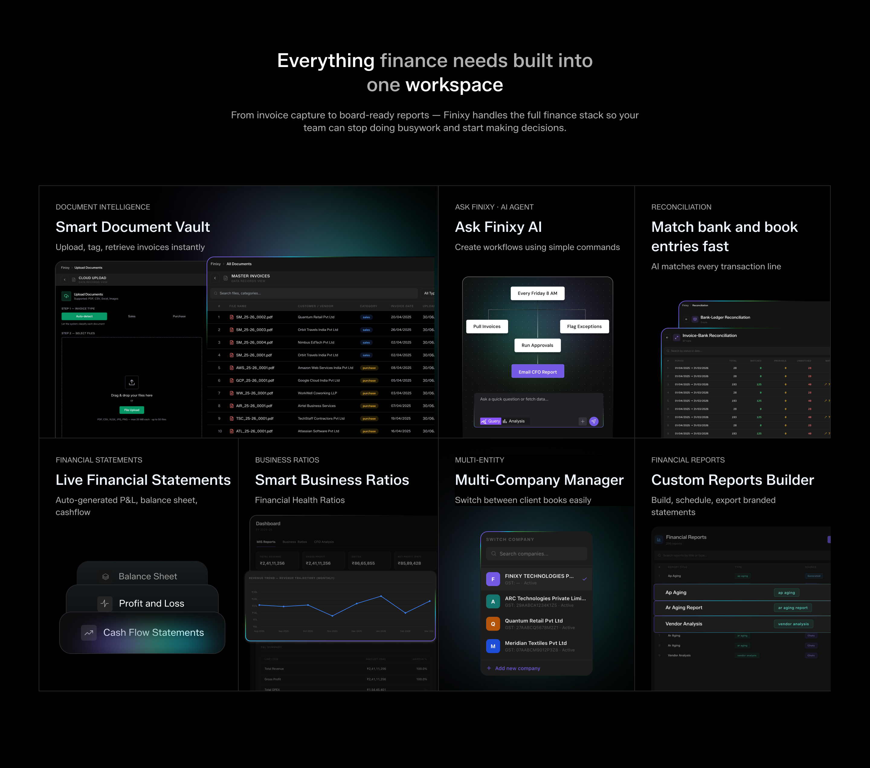
We have completely rebuilt the Finixy landing page from the ground up. The earlier version focused mostly on messaging, but it never really showed people what the platform does once they are inside it. This update changes that. Every core capability of Finixy is now presented with real visuals instead of plain text, so a visitor can actually see the product before they even sign up. The new page walks through the entire finance workflow in a much clearer way. It shows how Finixy automatically captures documents into a smart vault, how the Ask Finixy AI agent lets anyone build a workflow just by typing a plain sentence, and how bank and book entries get matched automatically during reconciliation. It also highlights live financial statements, smart business ratios, multi company management, and the custom report builder, all shown with real dashboard style visuals instead of generic icons. We added a dedicated section explaining the three engines that power Finixy underneath, confidence scoring, anomaly detection, and cross company reconciliation, so visitors understand why the platform feels reliable and not just automated. The integrations section was also reworked to clearly show how Finixy connects with Zoho Books, Gmail, and Tally, giving people confidence that it fits into tools they already use. Overall, the goal of this revamp was simple. Stop describing Finixy and start showing it.